After watching a Grid tutorial recently, the thought occurred to me that there would be no better exercise for understanding the fundamental concepts behind Grid than attempting to reproduce a painting by the Dutch painter Piet Mondrian.
Mondrian – famous for his De Stijl phase – is by many considered the father of modern layout design.
So, which one of his simple but abstract layouts to choose? As a man of great taste I decided on Composition No. III, with Red, Blue, Yellow, and Black. Painted in 1929, and recently sold at auction for $50,600,000.
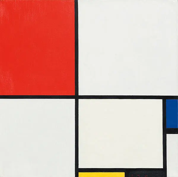
Before we get our paints out, let’s create a canvas:
[codepen placeholder – work in progress]
Grid is flexible (responsive) out of the box, so normally there’s no need to define heights and widths, however in this case we’ll set them explicitly to match the original size of the painting (50.0 x 50.2cm) and ensure we maintain the correct aspect ratio:
[codepen placeholder – work in progress]
The next step is to set the display property to grid:
[codepen placeholder – work in progress]
And what happened? Nothing. Still just an empty canvas. To actually create a grid we are going to use two properties as follows.
[codepen placeholder – work in progress]
Still nothing? Let’s inspect! … and now on the canvas we see a grid with 20 equal columns and rows.
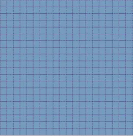
Defining column height/width as fractions
The unit fr we used in the code above stands for fraction. Writing repeat(20, 1fr) sets each field to be 1/20th of the grid’s full width.
With Grid it’s still possible to use pixels and percentages (or combine the three), but for our purposes using fr is the best approach. fr is very useful since nothing needs to be defined explicitly. Furthermore, to avoid having to write fr 20 times, we can use the repeat() function.
While I was recreating this painting for the first time it was at this point that I noticed that it would be more precise to use a 21/20 grid – with the additional column set to half the width of the others.
But that’s okay … no-one said the fraction values have to be integers!
[codepen placeholder – work in progress]
To be sure what’s changed, inspect:

Painting our first brush strokes
What’s next? In the painting there are eight painted sections, so we’ll create these with HTML:
[codepen placeholder – work in progress]
Now we can start to position our fields – or as they are called in Grid terminology items – within the 21×20 grid.
We’ll start off with the top-left red item:
[codepen placeholder – work in progress]
If we inspect our progress again we’ll see that our first (red) item extends:
- Across 9 columns (from the 1st to the 10th vertical gridline)
- Across 11 rows (from the 1st line to the 12th horizontal gridline)
Note here that we are counting in terms of the gridlines rather than the space between the lines (i.e. columns/rows).
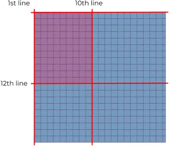
Now let’s continue with the next section to the right, Mr. White. This time we’ll start vertically from gridline 10 to 21, and horizontally gridline 1 to 12:
[codepen placeholder – work in progress]
Now we have two adjacent items, it’s time to add the black border between them. Instead of achieving this using borders, we’ll make a use of the grid-gap property:
[codepen placeholder – work in progress]
This creates a gap of 10px between both our horizontal and vertical gridlines. By setting the background colour of the canvas to black, that gap will be visible as black space as well.
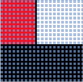
Since our gridlines are now grid gaps, from now on we’ll be counting gaps instead of lines. Confused? Inspect!
Simplifying things with some shorthand
By this point we can now see our first two items, red and white, with a gap between, plus the background of the rest of our canvas, which is black.
Let’s turn that remaining space into a work of art:
[codepen placeholder – work in progress]
This time we’re using shorthand, spanning 9 columns (from the vertical grid gap 1 to 10) and 9 rows (from horizontal grid gap 12 to 21).
Continuing in this vain, we end up with something like this:
[codepen placeholder – work in progress]
That blue field’s not quite right …
I hear you! The border between the last two fields should be thicker. To accomplish that we are going to use … guess what?
[codepen placeholder – work in progress]
Our very own work of CSS art
So what did we end up with? Well, not a perfect reproduction, as you can see below we have two slight imperfections. Although we could tweak our borders or columns to match the painting exactly, somehow I find it a fitting nod to the master Mondrian to lay down our easel here:
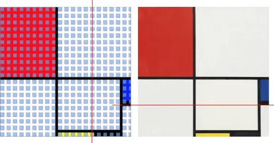
Unfortunately the picture we’ve created together isn’t worth anything like $50 million, but I hope it’s helped to show you the value of CSS Grid.
Next steps with CSS Grid
CSS Grid represents a new way of looking at things and sometimes it’s difficult to change old habits, but being able to explore, experiment, break and build, to constantly improve our skills and push things forward should be the fun part of what we do. Grid is new to all of us and that makes it even more exciting as all new usages and examples are valuable and appreciated.
Fun as it was, this exercise barely scratched the surface of CSS Grid and used only a few of the more than 20 available properties. I would suggest Grid by Example by Rachel Andrew as a starting point for further learning.
You can also read more about my own journey through the world of HTML/CSS layout.


