I enjoy listening to colleagues and friends talk about the good/bad old days of web design, in particular how in the past it was common for certain unintuitive, hacky and otherwise insane approaches were considered best practices for solving common web design challenges.
Here I’m thinking about everything from using multiple image files to give a square box round corners, inserting strange characters into CSS to exclude/include certain browsers, to all sorts of other confusing approaches to deal with what would seem like fairly straightforward layout tasks.
Given that page layout is one of the most fundamental aspects of designing a website, it seems surprising to me that CSS didn’t provide a better method for binding all of our page elements together from day one.
Below I’ll look at each of the most common methods for handling page layout in a little more detail.
So which approaches were/are most common?
<table></table>
On day one, there was the HTML element <table>, which was great for building tables. As website layouts became increasingly complicated, <table> soon also became the go-to method for building page layouts.
How this method become so common? If we take a look at the page structure of a typical website from that time, it’s not hard to see the similarity with a simple table layout:

Unfortunately, as the website gets more complicated this approach quickly leads us down the fiery path to nesting hell, with tables inside tables inside tables inside … which quickly becomes hard to understand or manage.
In addition, the need to make layouts responsive ousted this approach entirely and returned <table> to its initial use … as tables.
Although it’s pleasantly nostalgic to look back at older websites built with who-knows-how-many nested tables, this method has rightly been confined to the CSS history books!
display: inline-block;
I still remember building my first ever website navigation bar. I wanted to align three blocks next to each other in one horizontal line, and so – on the advice of some online forums – I innocently used display: inline-block;.
Of course, instead of this:

The following happened:

At first I assumed that I’d made a mistake, or discovered a bug … but guess what, it turned out this is a feature! When the CSS property display: inline-block; is applied, the three elements behave (correctly) as inline elements, i.e. as if they were three words in a line.
As a consequence, any whitespace between them in the HTML code is interpreted (again correctly) as relevant, and rendered as such … in my case an annoying and unwanted gap.
There are/were a variety of solutions as to how to fight this gap as described here by Chris Coyier. Personally I liked the Zen-like creativity of just simply removing the closing tags within the HTML:
	<ul>
	  <li>fight
	  <li>the
	  <li>gap
	</ul>
However in the end I used the following CSS solution:
	ul li {
	  display: inline-block;
	  margin-right: -4px;
	}
Although this worked fine, here we have to keep in mind that the width of the unwanted gap depends on the font-size, and hence so much the negative margin we apply to cancel it out.
At the end of his article, Chris Coyier recommended using floats instead, but by this point I was mentally exhausted and so floats would have to wait for my next challenge.
floats
Another, slightly more recent, approach was the use of the float property in combination with various forms of clear: both; and often a dedicated .clearfix class applies to various elements.
By combining these methods with the CSS position property one could achieve a lot, but to make things work we invariably ended up hacking (at least a little bit) and wasting energy making things work that should have worked out of the box.
It’s not that anything was wrong with float: left;, just that we were using it for a purpose other than the one for which it was originally intended.
This is float at it’s best:

display: flex;
The introduction of the display: flex; property around 2012 was a real step forward, solving many existing layout problems and making web developers and designers generally quite happy.
For page layouts that can defined primarily in terms of either columns or rows, flexbox behaves fantastically. For instance, if we want to align three boxes in a single row, display: flex; provide us with a modern and easy way to do so:
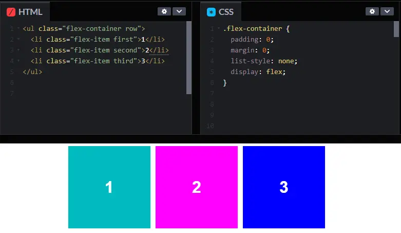
Or, if you want to build responsive and flexible navigation as illustrated in this example.
When isn’t flexbox the right approach?
If you need to construct a more complex and fully controllable layout – thinking in terms of both columns and rows – flexbox reaches its limits.
Let’s say your designer asks you for a layout along the following lines:
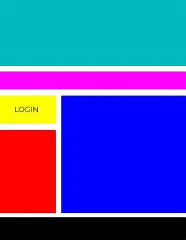
Not a problem, you say … until you find out that he/she also had very specific ideas for how the layout should respond to mobile devices:
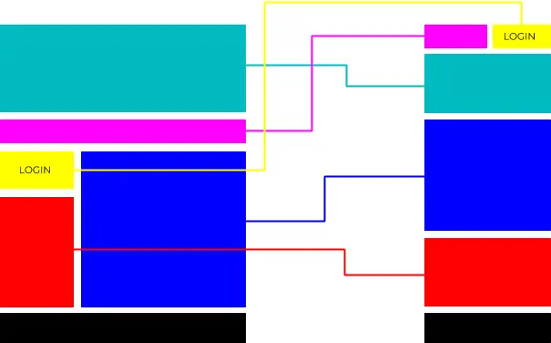
This is the moment at which you scratch your head and remember that the designer is definitely not your favourite colleague.
To achieve the above – implemented using flexbox – Javascript is needed to manipulate the HTML elements, since as you can see the elements themselves have changed their order.
Just when I was starting to suspect that both the CSS community and web browser developers are a group of masochists who refuse to develop a proper layout solution … CSS Grid entered my life.
CSS Grid
At this moment in time display: grid; is the only CSS property intended for building flexible responsive grid layouts. This sort of layout requires a layout area which can be manipulated in two dimensions – both horizontally and vertically – and this is precisely what CSS Grid does.
While display: flex; gives you full control over either columns or rows, using display: grid; we can take control over both at the same time.
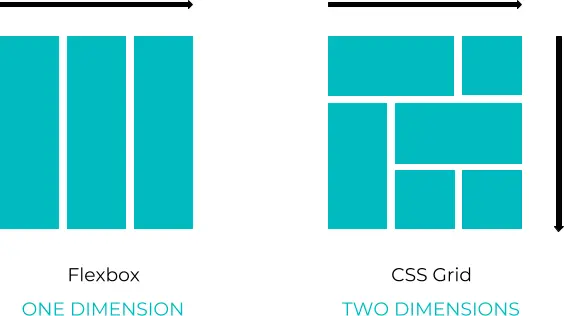
With CSS Grid, the challenge we faced above can be easily solved using only CSS, since now we have full control over the position of each field within our grid system.
Goodbye to flexbox?
No.
Flexbox and Grid serve different purposes and are both very useful. As shown in the examples above, sometimes flex is the best solution.
Flex and Grid also work very well together: you can put a flex element within a Grid element and vice versa. The important thing to decide in each case is which layout system is best suited for that layout.
A common approach here is to use Grid for full page layouts and Flex for everything else. This is a great rule of thumb, however it’s also possible – and sometimes the right approach – to use grid for building components as well.
Before you start developing, the first step should perhaps be to consider whether the component you plan to build is one-dimensional (Flex) or two-dimensional (Grid).
Getting started with CSS Grid
It’s been a long journey from HTML tables to CSS Grid. For me it was inspiring to read about all of those creative and resourceful developers who made the most out of the available properties and defined best practices as they went.
However, CSS Grid, is now becoming a new standard. If you’re interested in a practical and fun introduction to Grid, check out my short article Building a layout worth $50 million with CSS Grid, in which – with only a few Grid properties – I recreate one of the most famous paintings of the avant-garde / De Stijl movement 🙂


